Natural Green Dye Came At A Deadly Cost
Look at the color green, and it’s quite easily associated with freshness, enlivenment, and nature. So it’s ironic that such a color has such a deadly history. Yet, the fondness for nature wrapped up in the fashion and design market encapsulated the term green with envy. People couldn’t get enough of the color, even if it came at a cost. It was during the late 18th up until the late 19th century that green was the color, not of life, but of death.
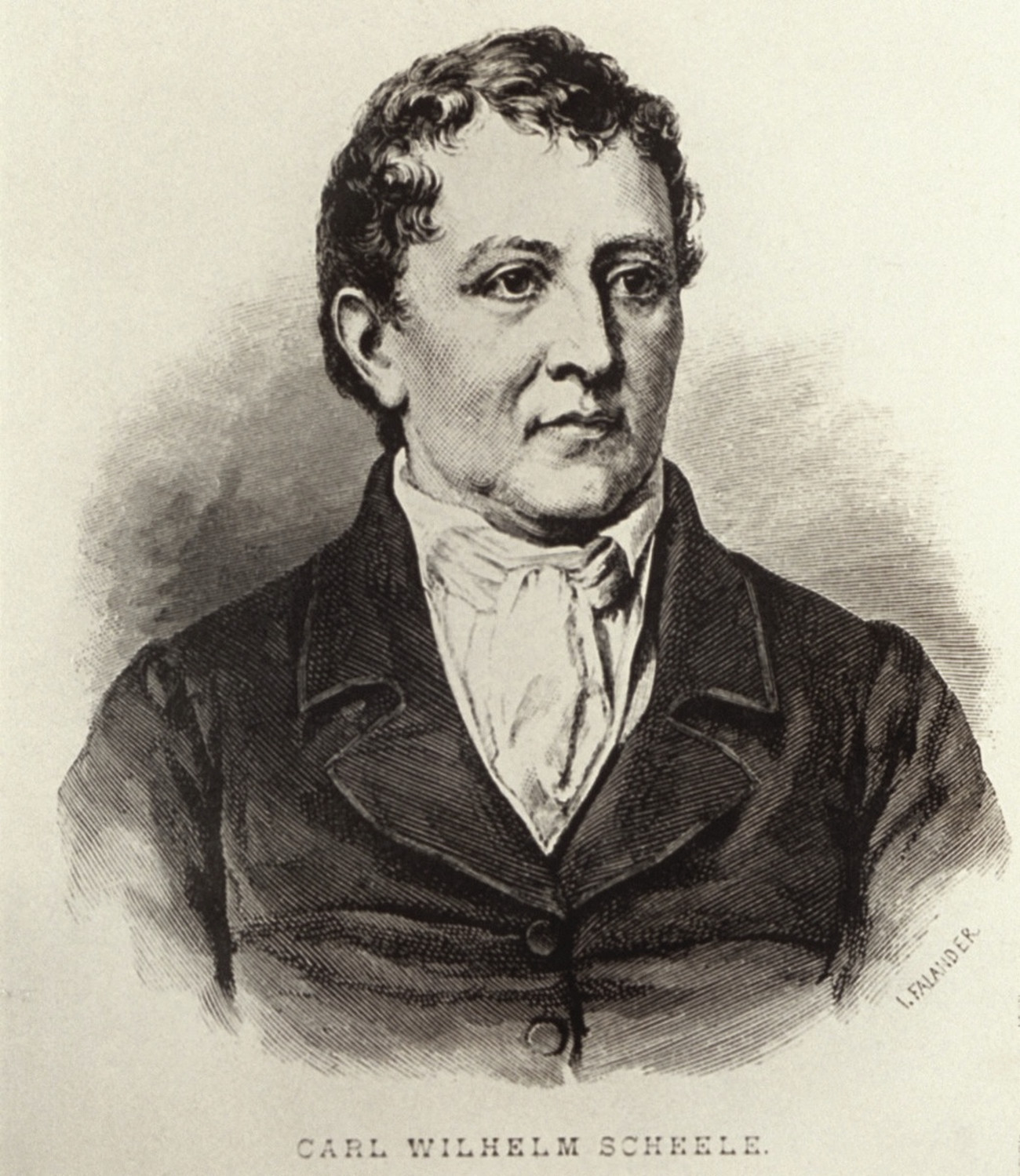
The story starts in the late 18th century when a Swedish chemist, Carl Wilhelm Scheele, accidentally stumbled upon this attractive shade. Coloring was not his prime goal, but seeing that it was profitable, took the color and planned on selling the chemical compound. The Colonial Era was a time that saw new decorative and architectural trends, the functionality of the space was livened up with pops of color. Blues, yellows, creams, and reds were the most popular color shades, but green was always a struggle. You could get green coloring, however, it was never that bright, natural vegetal green you found in nature. Before Scheele, most greens were made by overlaying blue and yellow together, which worked, but over time the overlayed green color faded and discolored to a brownish yellow.
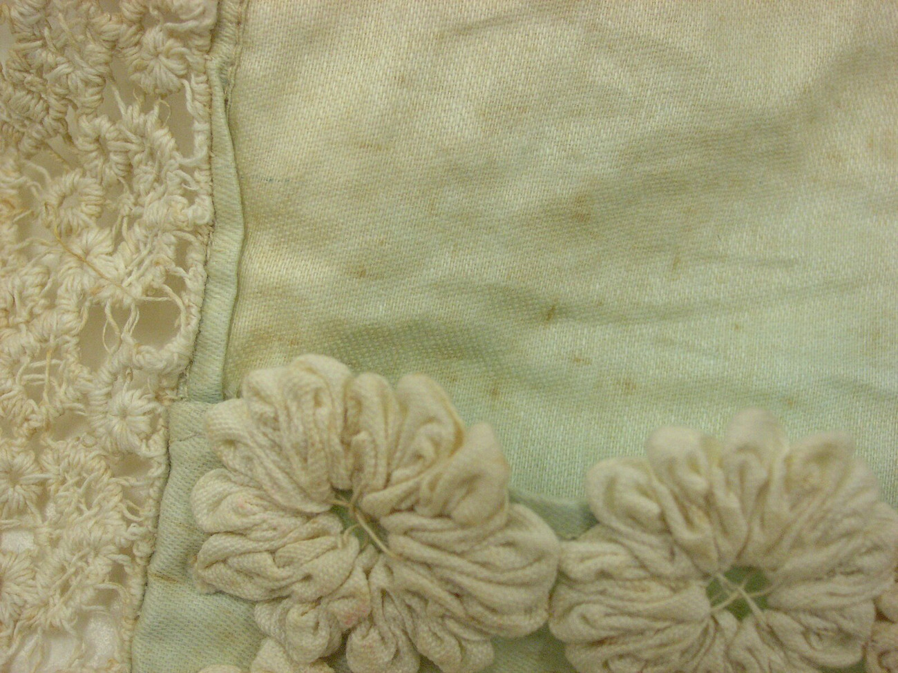
Scheele’s green was different. It had no gray undertones, no brown hues — Scheele’s green was the vibrant you’d find in nature, and it didn’t fade as fast. Made at the beginning and produced throughout the Industrial Revolution, this green had even more meaning. As cities became crowded and more urbanized jobs became in demand. The once-frequented interactions people had with nature decreased, and people’s longing for that often romanticized pastoral world increased. For people living in urban environments, Scheele’s green was a vibrant connection that reminded people of nature.
It was bright, it was cheap, no caveats, right? Well, it was a little poisonous. The chemical compound copper arsenite relied on arsenic, lots of arsenic. At the time of its creation, arsenic was used in a variety of facial powders, pottery, wallpapers, candy coatings, and textiles, probably none had as much as this new green color.
Many sources state that people’s understanding of arsenic’s toxicity wasn’t understood, but this is far from the truth. By the 1860s, arsenic’s toxicity was quite well known. Any average household would have arsenic in their supply closet to fend off pests and rodents. Arsenic was also called inheritance powder in the era, hinting that it was used for murder. Arsenic was poisonous, but to what extent, people did not seem to know. Most people of the time assumed that you had to ingest or lick the wallpaper or fabric to get poisoned, but unbeknownst to them, the wallpaper would flake, and the particles would float in the air. With fabrics, the dye would leach into the skin’s naturally moist and permeable barrier.
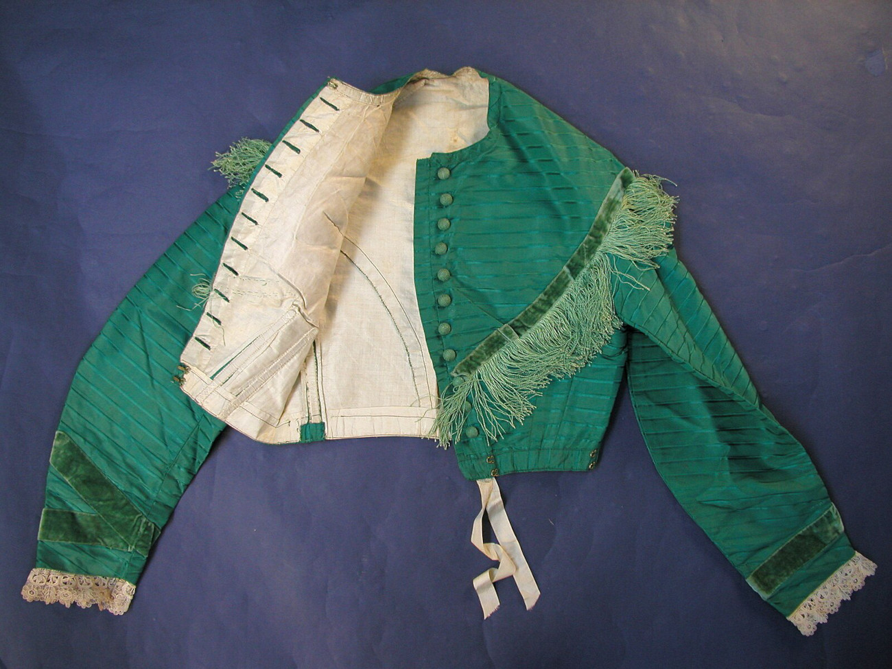
Yet the color sold, and it sold well. It was incorporated into wallpapers, artificial flowers, and textiles. And it is in these products that people saw the most deaths. When exposed to moisture, such as clothes (from rain and sweat) and textiles (from household mold), the arsenic in the green compound would vaporize into an arsenic gas. After repeated wear or overuse, the textile or paper would deteriorate, and the dust particles would be inhaled.
Before germ theory, the infant mortality rate was always high, but green dyes could have and did play a role in many deaths. After rubbing up against green wallpapers or rugs, countless infants were reported dead in a matter of days. Women — for whom the color was immensely popular — reported skin lesions, boils, and severe gastrointestinal pain before dying, many in a green wallpapered bedroom.
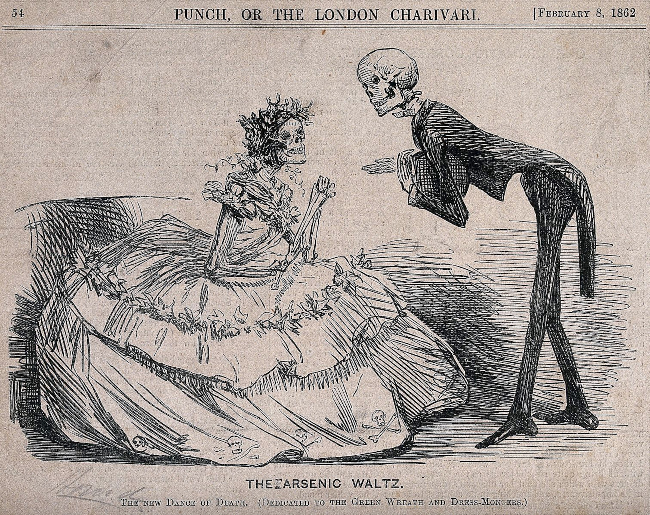
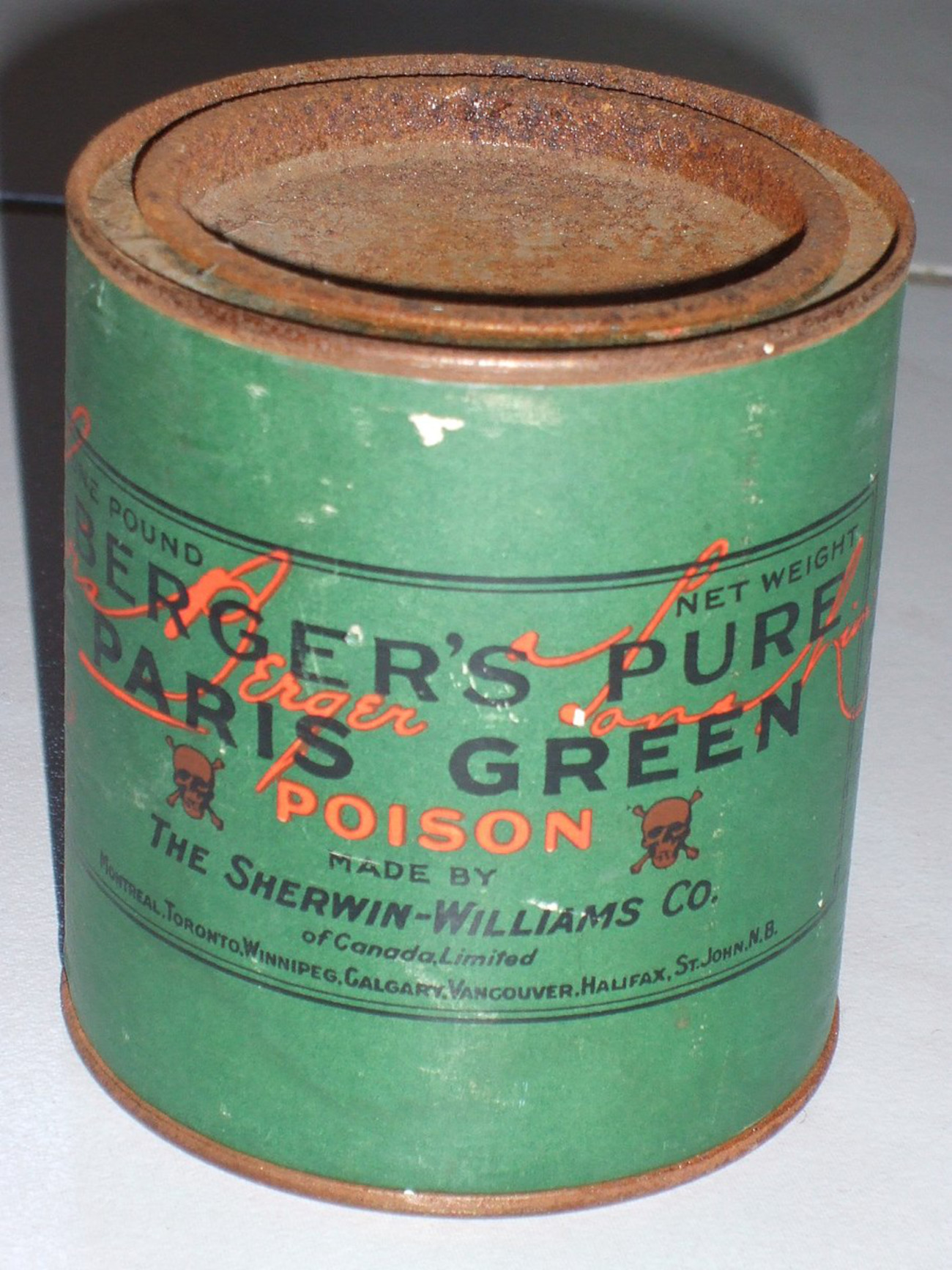
The demand for this vibrant green color was so high that in 1814, chemists Wilhelm Sattler and Friedrich Russ improved upon Scheele green in Germany. The Swedish chemist’s first green evidently faded after exposure to water or sweat, but this new green was more durable. Titled Paris green, it had more arsenic, resulting in a long-lasting vibrancy. Yet, the toxicity level of Paris green was so much greater than Scheele green that factory workers would die while producing it.
Again this did not stop people from purchasing it. However, by the 1850s, doctors knew of the correlation between these green dyes and poisoning. Many doctor manuals in both England and the US write that if a patient is feeling nauseous, weak, fatigued, or has skin irritations (and the same patient has green carpets and wallpaper), then that patient should keep the windows open to dispel the arsenic gases.
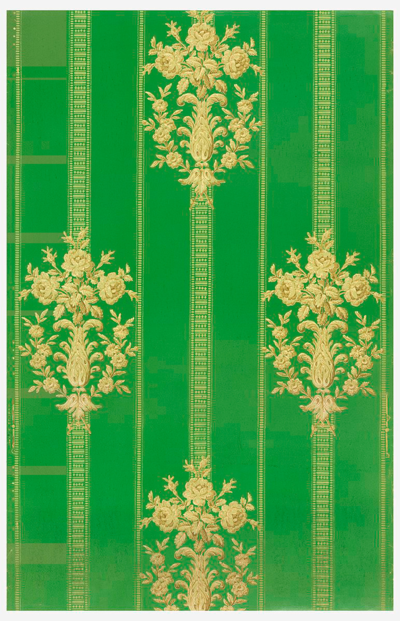
Despite both doctors and consumers knowing of arsenic’s dangers, there was no real pushback against these arsenic dyes until the late 19th century. Europe was quick to enact regulations, but it took some time. Queen Victoria’s personal experience when a dignitary visiting Buckingham Palace fell ill in the presence of green wallpaper, may have been a catalyst for such legislature in England, which occurred in the late 1890s. However, real change actually started on a grassroots level. People were retaliating with their pocketbooks, albeit a little late to the game. With a demand for nonpoisonous green came innovation. By the late 19th century, cobalt green — also known as zinc green — which was far less toxic than either Scheele or Paris green, replaced the arsenic green dyes.
The history of green dyes shows that natural looking doesn’t always come naturally.

