See How Vintage Labels Of Some Our Most Common Household Products Have Changed

Ever look at today’s products and feel like everything is a bit…blah? The fonts, colors, and designs seem to blend to make quite a boring feast for the eyes. If we go back in time we’d see advertisements and packages that were quite different. Here are just some of the whimsical designs of products that are manufactured even today.
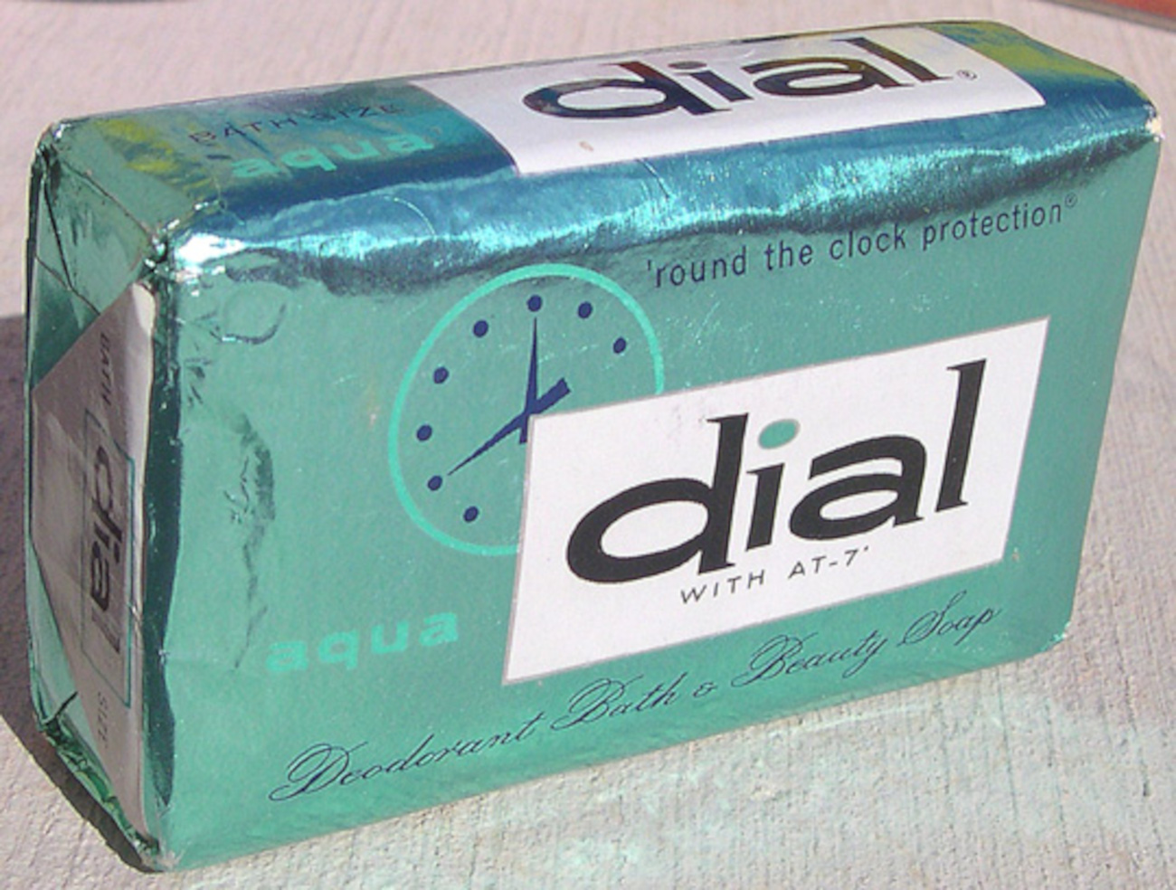
Dial was the first soap in America to be marketed as antimicrobial, which was a big thing. By the late 1940s, the concept of scientific homemaking made its way into the American household, where the standard of clean and germ-free became marketing terms for many household products. The packaging of Dial products is now lost on us, and modern-day labeling gives little indication of why Dial is called Dial, but the vintage packaging relays the message quite well. Dial indicates the dial on a clock and by using this soap you were getting “around-the-clock” protection against odor.
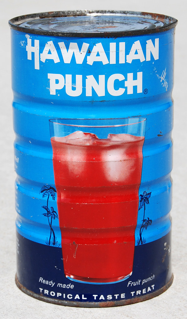
Hawaiian Punch has certainly fallen to the wayside, but this ice cream topping turned mix-drink was something of a commonplace item in mid-century fallout shelters and pantries. Nowadays, the labeling is much smaller and toned down, but the classic tins were designed with an interesting marketing tactic. In 1963 the tobacco company R.J. Reynolds acquired Hawaiian Punch from its founders and the new company skillfully marketed the drink to children just as they successfully marketed cigarettes to adults. They played on the bright contrasting colors of red and blue, making the tins attention-grabbing to children shopping with their mothers.
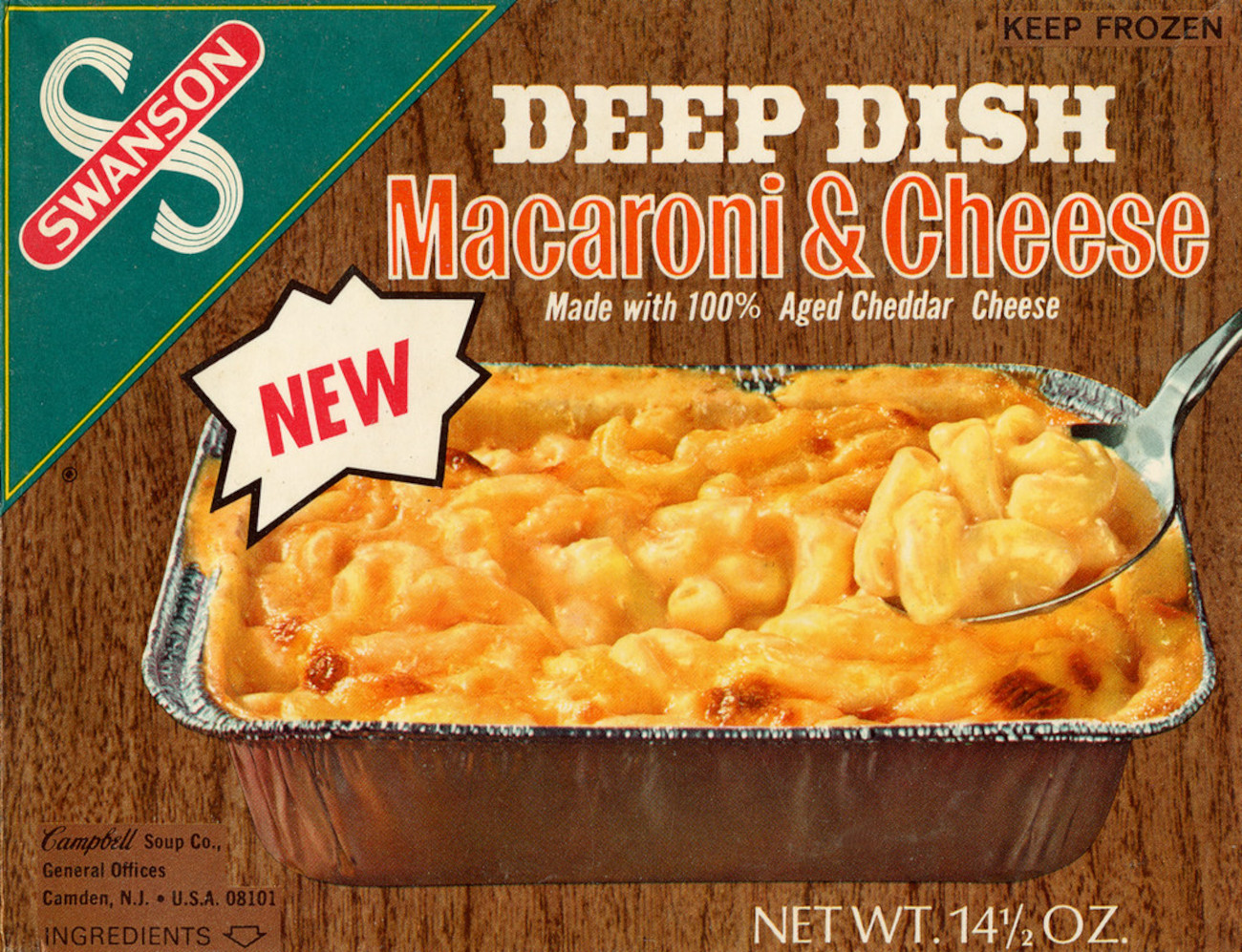
Swanson TV dinners came about as a way to sell an overstock of turkey meat. The marketing for frozen meals as the new modern family meal, replacing the prep for cooking from scratch. Today the colors are a little bit starker with a bright blue, the older designs of a wood background and green try to invoke a classic Americana kitchen table.
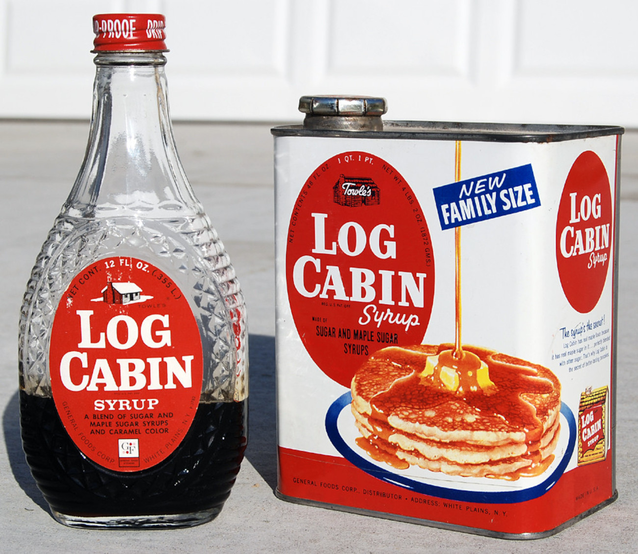
Again the standardized packaging of today’s Log Cabin is nothing to bat an eye over, but back in the day, the design was quite fun, especially the tin. This 19th-century company designed the house-shaped tin in homage to former president Abraham Lincoln, who was famous for being raised in a small log cabin, it was marketed and sold in these patented tins from the late 1880s, and even though they stopped selling pure maple syrup, they continued selling their maple syrups “blends” in the same shaped tin for decades to follow.
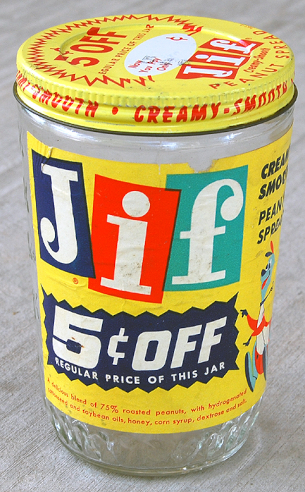
The bouncy blocking of the Jif peanut butter logo ties in with the marketing strategy of the late 1950s which was a mascot called Jiffaroo the kangaroo. Primary color blocking was a familiar design element and even mirrors the NBC logo of the same era, and as the years progressed, the colors of the Jif logo shifted in order and straightened up for a more serious, stiffer appearance.
Do you miss the marketing designs of yesteryear? Do you think more brands will start using their original styling?