If you’ve ever driven into Disney World you’ve probably noticed that the happiest place on earth has different road signs. They’re not like your typical green-and-white traffic signs. Instead, these are purple-and-red signs that look quite fun. However, there is actually an interesting story behind the color scheme.
The whole of Disney World really makes you feel like you’re in a different world entirely – and the road signage is just a small part of it. It’s basically one of the small details that Disney pays attention to when making guests believe that they’ve entered into a whole other self-contained realm that is different from the rest of the world.
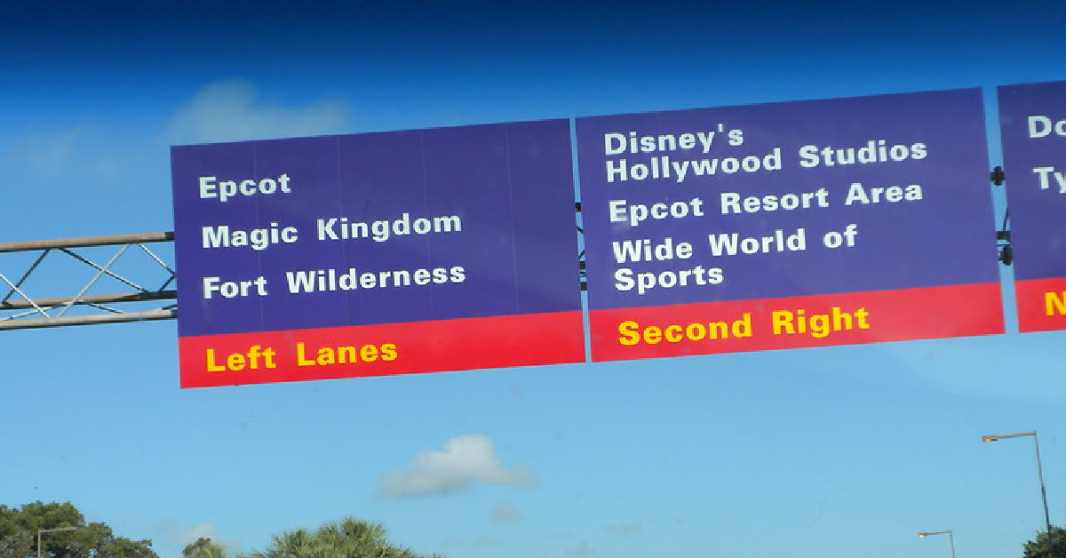
It isn’t just the signs into the park. These purple-and-red signs can be found throughout the park in order to help you find your way to the Disney World parks, hotels, and attractions. For those who have been to Disney World, it works! As soon as you see those particular signs you know you’re entering a whole new Disney adventure.
In case you’re wondering, the signage color scheme isn’t random. There is actually a lot of thought that went into it. The signs were developed by Deborah Sussman, a well-known graphic designer. Back in 1989, her company – Sussman/Prejza & Co. – was approached by Disney Development Co., looking for a new traffic sign design that would be unique to their expanding empire. According to the project requests, the traffic signs should be “unique in spirit, clean, easy to follow, and capable of being expanded.”
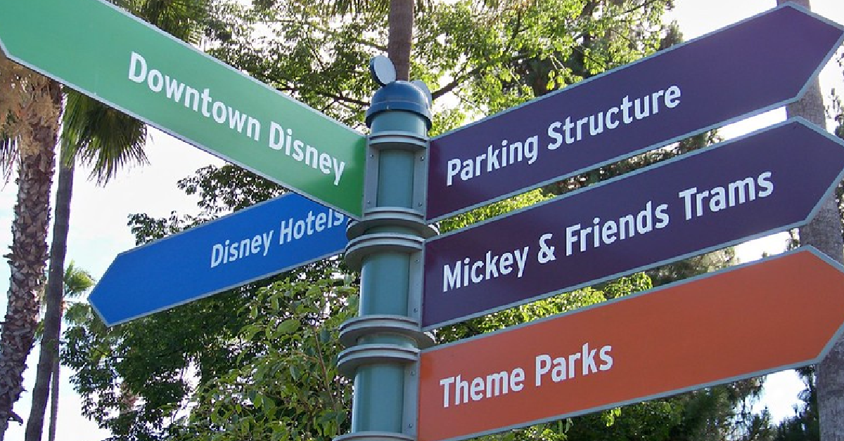
Those were the parameters in which Sussman was supposed to work. From there, she took inspiration from Disney’s most famous mouse: Mickey Mouse!
The Disney podcast Mouse Chat has actually referred to the signs’ color scheme as being an “abstract view” of Mickey’s own personal color combo. It brings to mind Mickey’s black, red, and yellow colors from his fur, pants, and shoes. And some of the smaller signs even have little mouse ears at the top of them!
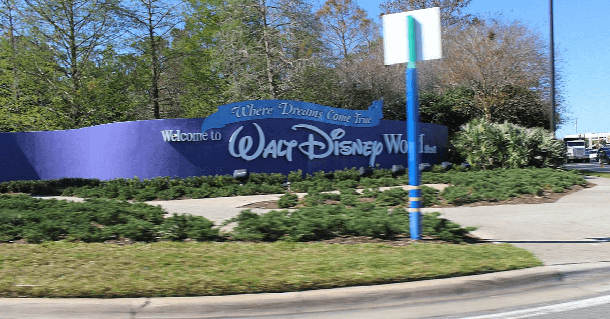
While the signs are purple instead of black, it still isn’t known why Sussman chose to swap the two colors. The best guess is that black traffic signs are much tougher to see at night.
From a less practical view, the Disney YouTuber Midway to Main Street has suggested that perhaps it was simply an aesthetic choice as purple is a complement of yellow – one of the colors featuring in the sign design. But the truth is we won’t really know why. What we do know is that Disney has done a great job of making itself the happiest place on earth!
